Over the years, Custom Challenge Coins has had the privilege of working on some truly amazing coin designs. While every coin we create holds deep meaning, there are a few that have really resonated with us or stuck in our memories. We’ve selected a few of our absolute favorite designs to share with you.
Innovative Coin Design Elements and Overcoming Challenge in Military Coins
Talk about a fun design. Even if you haven’t seen Guardians of the Galaxy(which you should, just for the talking raccoon), you can immediately appreciate all of the hard work and craftsmanship that went into this coin.
Guardians of the Galaxy Challenge Coin
Challenge Coins: A Blend of Tradition and Modernity
Let’s start with its unique shape. When you think “coin,” you’re probably picturing something like a circular medallion, right? Well, our design process allows us to create different shapes and sizes with ease. This rectangular design was perfect for a recreation of the font from the film that inspired this coin.
As you can see throughout this military challenge coin design, the level of detail is impeccable. From the stars that are making up the galaxy to the sheen of the lettering itself, this coin was a true joy to craft. The coin uses translucent enamel to give it that perfectly shimmery look. It’s almost glossy but in a way that isn’t overly flashy or showy. On top of that, the back is intricately detailed and truly speaks to the heart of the design.
Spartan Army Task Force Challenge Coin
The Distinctive Styles of Navy Challenge and Army Coins in the World of Military Challenge Coins
Just by looking at the finished product, you can tell that this is artwork amongst coin designers. From the striking imagery to the sharpness of the lettering across the coin, each and every detail is perfectly in place. While this coin does use a more muted color palette, the small pops of red and the distinction between hues truly help create a one-of-a-kind coin. When you look at the back, you see even more of the finesse. With the bright flourish of the central focus against the black background, the color contrast immediately draws in the eye.
These veteran coins are crafted with a mix of polished brass and black nickel. It then underwent a fairly unique sandblasting process that isn’t incredibly common in coin creation. As you can see, that extra time and effort really paid off. From the clarity of the coin’s details to the just-right tone, coloring, and texture, this creation was one that challenged us and really put our team’s skills to the ultimate test. Not to pat ourselves on the back too much, but it’s definitely a job well-done.
US Army Garrison Stuttgart Challenge Coin
The designing intent behind this particular coin took a dramatically different approach. The purpose of many military challenge coin designs is to look a little flashy and bold. The Army Garrison Stuttgart coin took an intentionally rough-around-the-edges approach and the end result is truly a standout amongst many similar coins. Take a look at the front. While the design itself is impeccably recreated, the coin shows signs of purposeful wear and tear. The edges of the coin look chipped and the overall effect seems as though this particular coin has been in circulation for years, if not decades.
When you look at the back, it tells a different story. The lettering is precise and helpful and easy-to-read. The colors of the flags are distinct and the lines are clear while retaining their sharpness. While the coin itself represents the rough and though military spirit of the garrison, the craftsmanship still holds true to our standards. It’s a perfect mixture of seemingly conflicting styles that resulted in a brilliant finished piece. It was a risky choice and a custom challenge but it really paid off in the end.
US Army Attack Recon Battalion Challenge Coin
Custom Coins: Personalizing Military Traditions
If you like a lot of colors, you’re going to love this coin just as much as we do. It’s bold. It’s bright. It stands out from the crowd. This coin was truly a pleasure to work on and our passion definitely shows in the final design. Let’s start with the front. Immediately, you see this bright, captivating blue that is contrasted by the brilliant red swords. The dragon’s eye is also red so you have an interesting focal point. The black and silver edges of the coin help that central design stand out even more. However, this doesn’t mean that quality was sacrificed around the edges. The silver lettering pops against the black background and, while it’s distinct, it doesn’t distract from the overall effect.
When you flip the custom coins over, you get to see some truly intricate detail and coloring. The lines of the dragon are sharp and defined. The different splotches of camo serve a dual purpose as they almost look like a dragon’s scales, too. Again, a bright pop of red lettering draws the eye but it quickly returns to the dragon with its lime-green eyes and flickering tongue. Not every design works with these many colors or details but this one is a coin that will be treasured by its carriers for years to come, true artwork.
Coast Guard and Space Force Coins: Pioneering Coin Designs in Military Challenge Coins
Professional challenge coins aren't just limited to the traditional branches like the Army, Navy, marine corps, and Air Force. The Coast Guard and the relatively new Space Force have also been making their unique mark in the military world of challenge coins.
US Space Force Challenge Coin
Coast Guard Challenge Coins: These coins often feature designs that honor the bravery and commitment of these military members. Emblems like anchors, lifeboats, and lighthouses are common, symbolizing the guardianship and rescue missions that define this maritime force. The vibrant colors and intricate designs often reflect the diverse roles of the Coast Guard, from coastal defense to environmental protection.
Space Force Challenge Coins: As the newest branch of the U.S. Armed Forces, the Space Force brings a fresh perspective to coin designs. These coins often incorporate elements that capture the essence of space exploration and technological innovation. Designs might feature satellites, stars, and other celestial imagery, along with the Space Force emblem. The military insignia represent a bold step into a new frontier, mirroring the mission of the Space Force itself; often featuring intricate soft enamel designs that bring each piece to life with vivid colors and textures.
Both the Coast Guard and Space Force challenge coins not only embody the spirit and values of their respective branches but also challenge the boundaries of traditional coin designs. They blend history with modernity, creating tokens that are as innovative and forward-thinking as the missions they represent.
The Craft of Challenge Coin Design: From Coin Concept to Creation
These are truly representative of the work we do at Custom Challenge Coins. We can create designs that are fun, helpful and whimsical. We can create coins that are serious and reflect the honor and integrity of the service members that hold them. Our passion and commitment go into each and every coin we create. The team at Custom Challenge Coins aims to create unique designs that carry the memories and traditions of every military member.
If you want to learn more about our challenge coin designs or if you already have some ideas in mind, contact us today. We’re happy to provide you with additional information and give you a quote for your military challenge coin design.
Jack Thompson
Jack Thompson was born and raised in Grand Rapids, Michigan. After retiring from the military, Jack moved to Austin, Texas, to start a new chapter in his life. He has always been passionate about storytelling and decided to become a writer and podcaster. He runs a successful podcast where he discusses military history, shares personal anecdotes, and interviews other veterans. Jack also writes often about military traditions and history.
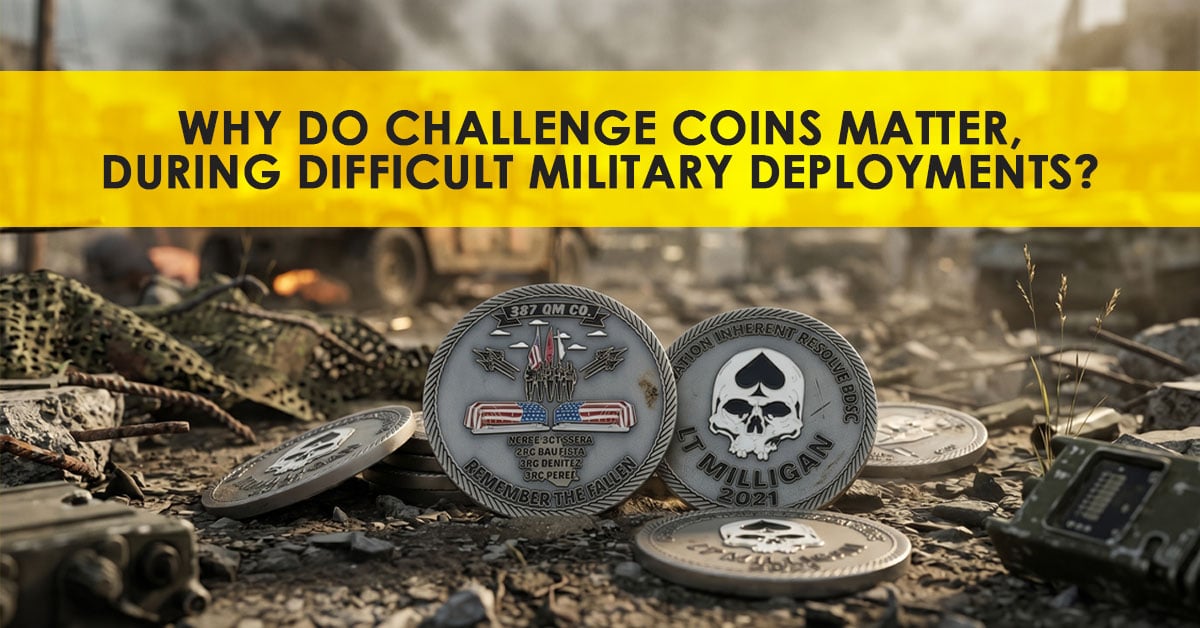
Learn how challenge coins support military morale during deployment by reinforcing unit identity, recognizing service, and strengthening camaraderie during overseas operations.
Though challenge coins started out as a military-specific practice, they’ve since extended to the general public. Families, groups, clubs, and even some businesses are getting in on the challenge coin action and it’s a fun tradition to partake in.
The presidential challenge coin was, and still is, one of the most coveted challenge coins ever made. Read this to learn why, and how it changed over the years.
Join Us to Get Savings!
Like a good deal? Sign up to get challenge coin deals delivered to your inbox. Join us today and save!
All Rights Reserved. All symbols, logos and slogans depicted are registered trademarks of their respective owners. The appearance of U.S. Department of Defense visual information does not imply or constitute endorsement. By submitting designs to CustomChallengeCoins.net, subsidiary of MetalPromo LLC, the purchasing party warrants that he, she, or it has/had the legal right to reproduce (or have reproduced) any logos or other images associated with his/her/its order. Samples on the site are for illustrative purposes only and are not for sale.